Thursday, August 03, 2006
Wednesday, August 02, 2006
Academic - Research & Reports
Now that i have completed my Post Graduation from National Institute of Design; I'm sharing my Academic works with others. All these works were done in NID and were done solely my me.
Research
User Testing of Adobe InDesign CS: using a Cognitive Walkthrough approach
by Abhishek Kumar;
Course : 'Cognitive Ergonomics'
Comparitive study of cultural impact on websites: A case study on banking websites of Saudi Arabia and United States of America; Government websites of France and Germany
by Abhishek Kumar;
Course : 'Cross Cultural Studies'
Usability
Task analysis of 'Meeting Request feature of Outlook Express
by Abhishek Kumar
Usability Evaluation of My Yahoo!
by Abhishek Kumar
Project Reports
La planete de memoirs
by Abhishek Kumar
CTZ : Citizen News
by Abhishek Kumar
Patterns in Data Visualization*
by Abhishek Kumar, Awinash Raj, Kumara Manikandan, Medha Yadav, Raina Saboo, Sonal Nigam
Systems Design: Office Management System for Architects
by Abhishek Kumar
All these reports are available; in case some one wants to read them kindly contact me.
* it was a group project report can be published if all of the group members agree upon.
La planète de mémoires
This is my ‘small effort’ to look at things ‘just a little’ differently. This is part of my academic project…which I want to share with you… IDEA
The genesis of ‘La planète de mémoires’ came from my previous idea of exploring the possibility of projecting images on trees. The idea was to explore the possibilities of projecting images or video in a VOLUME of space rather than on a flat SCREEN. Initially the plan was to project only one projection on the foliage of a tree, but then came the question that as this is a volume space why not project multiple images and create a moving (real time) 3D collage on a volume of space. But due to some reasons the implementation could not take place. But this idea lied latent before I stuck up with another idea – ‘Why not recreate a 3D surface and in case of projection we can have backlit screen.”
This idea is just an exploration of looking at pictures in a different way - spread into 'space'. With digital cameras, we are all flooded with images. The number of images in our lives is mounting so high that we rarely take out time to see them. It display is a Globe (sphere) with small cubes all aligned together inside them. Each side displays a portion of an image so that the combination makes a substantial part of that image. But to be able to see the image one has to conciously stand in position to make sense of it. Else we only see them in parts- as collage of memories (images) in our life. With a projector on the top it also allows you to project an image on any surface…
- from my project report.
© Abhishek Kumar, 2005
Friday, December 23, 2005
Data Viz...
The first phase of deasig is to research on the data…what has to be conveyed??? What is the point of view??? Which relationship of the data is important for the graphics to be effective???
Now my research started with the data given to me…(it was an academic exercise)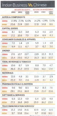
If you look closely this data has numerous relationship between each other…
1) Comparative relationship of each data between India and China
2) Comparative relationship of data of ‘one countries’ between years 2001 to 2003
3) Comparative relationship of data across India-China between years 2001 to 2003
4) Comparative relationship of sectors…
5) Comparative relationship between ROI and ROE
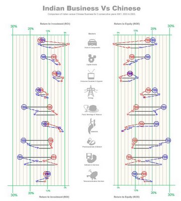
Now my objective of this graphics was to bring out the above comparative data is a way such that it highlights the comparisons and thus to bring clarity.
The Design Method
To show various comparisons I used various methods:
- The color code to differentiate between India and China (India in blue and China in Red)
- The change in Typography to differentiate between years…
- A light colored dotted line to guide the ‘eye’ to bring out the comparison in data across year.
- A straight line to help in comparing the data between the two counties in the same year.
- The gird on the back help in finding an approximate values…change in grid line color and width marks the threshold, which help in judging the values.
- Increase in the typography and position of values to ease in perception of the grid thresholds.
- Positioning ROE and ROI across in order to see the relative value. I came to know that the relationship of ROE and ROI may not be very relevant or important.
- Use of graphics (icons) for sectors in order to speed up the perception.
Patterns in ‘Data Visualization’
As apart of our course in ‘Data Visualization’, we were asked to categories different Data visualization techniques. We took a little path to solving this problem…we took the challenge to solve the mystery and create a formula for ourselves…
The process started by collecting about 900 images of various examples of data visualizations. Next came and extensive session of “Brain Storming”…
Brainstorming threw quite interesting view to data visualization…things when categorized gave an interesting picture…
There are various facets to data visualization…
1. Tools
2. Methods
3. Ways of representation
4. Purpose
5. Content
Where Tools were graphical techniques primarily used to distinguish one data from the other…
Methods were various factors like choosing axis, degree of abstraction…etc…its various decision a designer takes before deciding the graphics.
Ways of representation were know “outputs” like pie chart, bar chart, illustration, maps etc…
Purpose is the purpose of making data visualization like instructional, comparison…etc
Content defines the kind of data…like quantitative, descriptive…etc
The next part was little interesting…we realized that Content Purpose and ways of representation were closely connected.
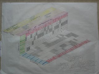
Not only that we sorted the 900 samples into a 2 way matrix to figure out how closely are they connected.
Monday, December 19, 2005
La planète de mémoires
This is my ‘small effort’ to look at things ‘just a little’ differently. This is part of my academic project…which I want to share with you…
IDEA
The genesis of ‘La planète de mémoires’ came from my previous idea of exploring the possibility of projecting images on trees. The idea was to explore the possibilities of projecting images or video in a VOLUME of space rather than on a flat SCREEN. Initially the plan was to project only one projection on the foliage of a tree, but then came the question that as this is a volume space why not project multiple images and create a moving (real time) 3D collage on a volume of space. But due to some reasons the implementation could not take place. But this idea lied latent before I stuck up with another idea – ‘Why not recreate a 3D surface and in case of projection we can have backlit screen.”
This idea is just an exploration of looking at pictures in a different way - spread into 'space'. With digital cameras, we are all flooded with images. The number of images in our lives is mounting so high that we rarely take out time to see them. It display is a Globe (sphere) with small cubes all aligned together inside them. Each side displays a portion of an image so that the combination makes a substantial part of that image. But to be able to see the image one has to conciously stand in position to make sense of it. Else we only see them in parts- as collage of memories (images) in our life. With a projector on the top it also allows you to project an image on any surface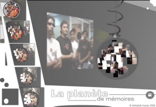 …from my project report
© Abhishek Kumar, 2005
CTZ news for Citizen Journalists
It seems that the field of technology is moving with the speed of light. When you get a GREAT idea and you ‘think’ it’s ahead of its time…and sudden you read some article on the same subject…and then you keep thinking…IS THE WORLD MOVING FAST or I’M TOO SLOW…
I am working on a project for the past one month on building a comprehensive system to support Citizen Journalism and Freelance Journalism… its more or less complete now… during all those one month, I kept telling my self ‘woow this should be ahead of its time…’
But then I read this News on BBC... (http://news.bbc.co.uk/2/hi/technology/4330690.stm)
...and I thought…oh my GOD…my idea won’t be new for a very long…
Before my so called ‘new idea’ gets OLD…I decided to publish it on my blog…so that I can sleep in peace…believing that it was ‘NEW’…though my project goes beyond what is mentioned in the article…but it’s no doubt a step towards my concept.
So here are some extracts from the Report of that project
Abhishek Kumar,
National
Ahmedabad,
With the evolution of web and mobile technology, citizens have now tremendous power to speak out their view points and be heard. The
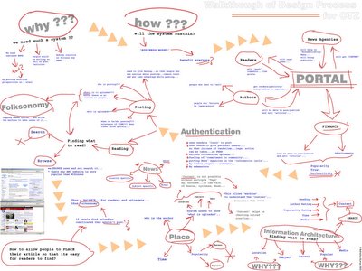
It tries to holistically conceptualize a sustaining system which can assist people not only to access the News but also allows people to post articles in all forms and also provides them with facility to sell those articles. It uses newly evolving Information Architecture paradigms of tagging or popularly known as folksonomy. Folksonomy is an excellent tool for reference purpose; but in this project it is also used for controlling and to create a browsing experience. As the content of the pages would be dynamically (that too with very less control on content) changing the tagging becomes very important controlling factor. Also as the ‘NEWS’ is primarily a browsing experience it tries to build up a system which supports ‘browsing’ than search. The project is built up along with a business process which would support such sites, because such project would be difficult to sustain without a proper support.
© Abhishek Kumar, 2005
Thanks
c ya
bye
Cultural Models & Interaction Design
Discussion
Hosftede model is good to give a broad perspective of what a culture is. The important point to
note here is that the parameters given by Hofstede are all relative values. So it is not correct to state that certain culture is “Feminine” or Power Driven. What Hofstede model states that one culture is more or less “Feminine” or what the case may be, than the other culture. One can broadly understand one culture with respect to the other. In my opinion that is the strength of that model.
When it comes to details of analysis, expectation or prediction; this model alone does not work.
And I don’t think this model was developed for that purpose. To do an analysis one has to experience the culture or the context to understand the people’s behavior and their liking or disliking. The situation becomes complicated when we try to analyze any artifact or a cultural opinion. The outcome of any artifact or opinion is simultaneously effected by all the 5 factors plus their oppositions- Power Distance, Individualism, Collectivism, Masculinity, Femininity, Uncertainty Avoidance, Long Term Orientation and Short Term Orientation. At it is still unpredictable as to what factor dominate and shape up the artifact or the opinion. Again one should not undermine the importance of Context in which that artifact or opinion is built.
After hours of trying to get a pattern or being able to use the Hofstede’s model unsuccessfully for
analysis of websites I have reached to a conclusion that his model can not be directly applied for analysis. With study of Halls and Hofstede’s model I came to a conclusion that these models can be clubbed and modified in order to make a model that can to an extent work in analyzing websites. This little formula is based on very few data and can be challenged. This formula seems to be working in my context and has been formulated after studying few patterns in the display of the page and information. This formula is based on the findings that High/Low Context, IDV, MAS, UAI and Religious Orientation can be primarily being identified as the influencing factors in a website...
this work is just a begining...to finally come to a concrete solution...i requires a lot of deep study and anlysis...but I was happy becoz this formula was working to some extent...
God bless you :)
